Kup stronę 60% Taniej
BLACK MONTH
BLACK MONTH
Do końca 2 DNI : 2 GODZIN : 2 MINUT : 2 SEKUND

Categories.
WebWave drag and drop website builder lets you create unique websites. You can build your website from scratch by starting with a blank page, or choose various website templates from our free collection and modify them according to your needs. With WebWave website builder, you have a complete website design and hosting system at your fingertips.
This website was created with WebWave.
Find us online
Contact.
Email us at:
contact@webwave.me
Or use the chat (Mon-Fri)
Website builder.
Offer.
Useful articles.
Best practices when building a website
In this article, you will learn about the best practices for building a website in WebWave website builder.
Adapting the site to different sized screens (RWD)
Sections.
Sections are fields in the builder that divide your website into specific modules or, if you prefer, sections. Sections help you maintain control over the content of your website. You can effortlessly move items from one section to another. You can also change the order of sections with one click.

Want to add a news section quickly? Use our composition panel, where you can choose from many categories and variations of ready-made sections that will help you quickly expand your website. Colors and fonts will automatically match your page settings. Change the texts and you're done!

Global Colors.
Global colors is an extremely helpful feature in the builder. With a few clicks you can change the colors of many elements in your project and take control of the color palette. Go to the global colors tab in the settings panel and select the color you want to change.
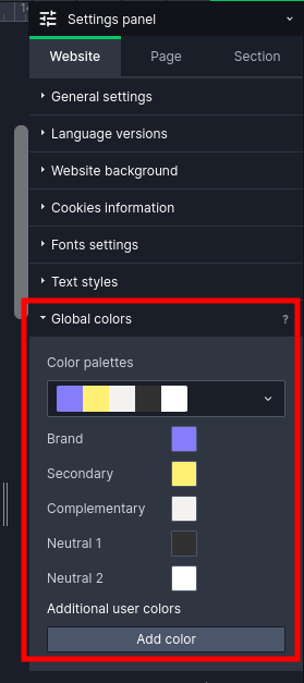
When adding a new element or modifying an existing one, you can quickly assign the global color using the shortcut below the color selection:

Text Styles.
Text styles are a similar feature to global colors, but as the name suggests, it helps you deal with text styling, not colors. You can define and modify the properties of basic text styles on your website. You can save a lot of time when you don't have to set the font type and size for each heading on your site separately.
Go to the settings panel and select the type of text you want to adjust under your preferences.

In the new view, modify the text properties such as font, size other. Note that you can set the size and behavior of the text depending on what device your page will be displayed on. Once you're done editing, click “Update text style” on the settings panel and you're done!

Now, just like with global colors, you can quickly change the appearance of individual text elements.

Adapting your website for screens of different sizes (RWD).
In an era where most of the website traffic comes from our smartphones adapting the website to smaller devices is crucial. In our creator, we have several solutions for this.
All of our templates, AI-generated pages and compositions are responsive, i.e. adapted for display on phones or tablets. If you only change texts, colors or substitute photos on the template, then you don't have to worry about RWD :)
If you create a site from scratch or change significantly the positions of elements on the page then use the auto-RWD function.

If you only changed items inside one section then select that section, click set items automatically and select under “Active section only”.

If you have changed a lot of elements on a sub-page then choose the “This sub-page only” option, and if you have a lot of changes on many sub-pages then use the “Whole page” option. Then go into the preview and see how your site looks on smaller devices. Make adjustments if the page requires it and you're done. Your site will look just as good on mobile as it does on a computer!
Grouping.
You can use groups both in the layers panel and on Canvas. With groups, you can better manage the growing number of layers and organize all the elements on your website. Grouping elements is also extremely helpful when you create a responsive version of your website. When you use the automatic page setup for different devices, the builder adjusts the layout taking into account the groups, and you will have much less tweaking to do. It's important to group elements that are close together and logically connected. To create a group, you can use the shortcut Ctrl+G.
