Kup stronę 60% Taniej
BLACK MONTH
BLACK MONTH
Do końca 2 DNI : 2 GODZIN : 2 MINUT : 2 SEKUND

Categories.
WebWave drag and drop website builder lets you create unique websites. You can build your website from scratch by starting with a blank page, or choose various website templates from our free collection and modify them according to your needs. With WebWave website builder, you have a complete website design and hosting system at your fingertips.
This website was created with WebWave.
Find us online
Contact.
Email us at:
contact@webwave.me
Or use the chat (Mon-Fri)
Website builder.
Offer.
Useful articles.
Position and size panel - dynamic values
If you have been creating websites in WebWave website builder for a while, you probably noticed that most of the websites built in this software look kind of similar. The reason was the limited site width - 1200px which made creating websites with full-screen size impossible.
But not anymore!
By using dynamic values you can add elements in any part of the screen, regardless of thier size, which will fit in every screen. Build unique RWD websites in WebWave - white label website builder with no coding!
Dynamic position
That option gives you ability to position your elements depeding on the corners of the screen.
You can attach any elements to left or right screen corner. You have to only set the Layout to the left/right side of the screen.

Alignment and size
Position and dimension allow you to set the alignment and size of the element on your website. These functions can be set in different units: px, VH, and VW.

Units' description
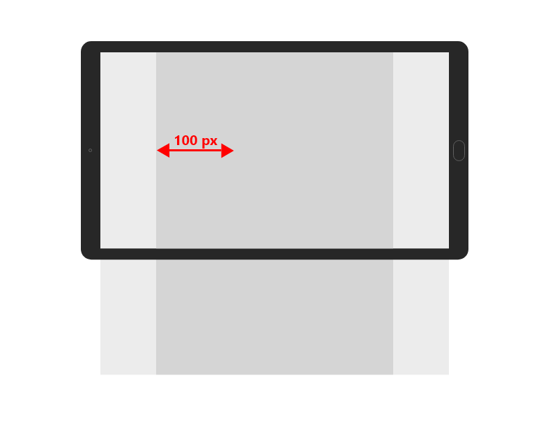
PX
It's a default unit in the website builder used for setting a static size and alignment of elements. Elements set in px will always have the same size and alignment, irrespective of the screen size they are being viewed at.
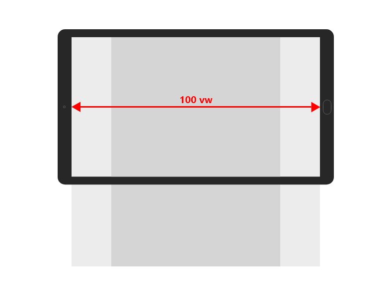
VW
The next unit is calculated in regard to the screen width. If you want the element to occupy the whole screen width, set it to 100 vw. When you set it to 50 vw, then the element will occupy a half of the screen width.
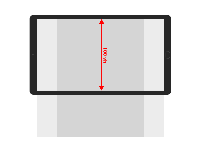
VH
This unit is calculated in regard to the screen height. If you want the element to occupy the whole screen height, set it to 100 vh. If you set it to 50 vh, then the element will occupy a half of the screen height.